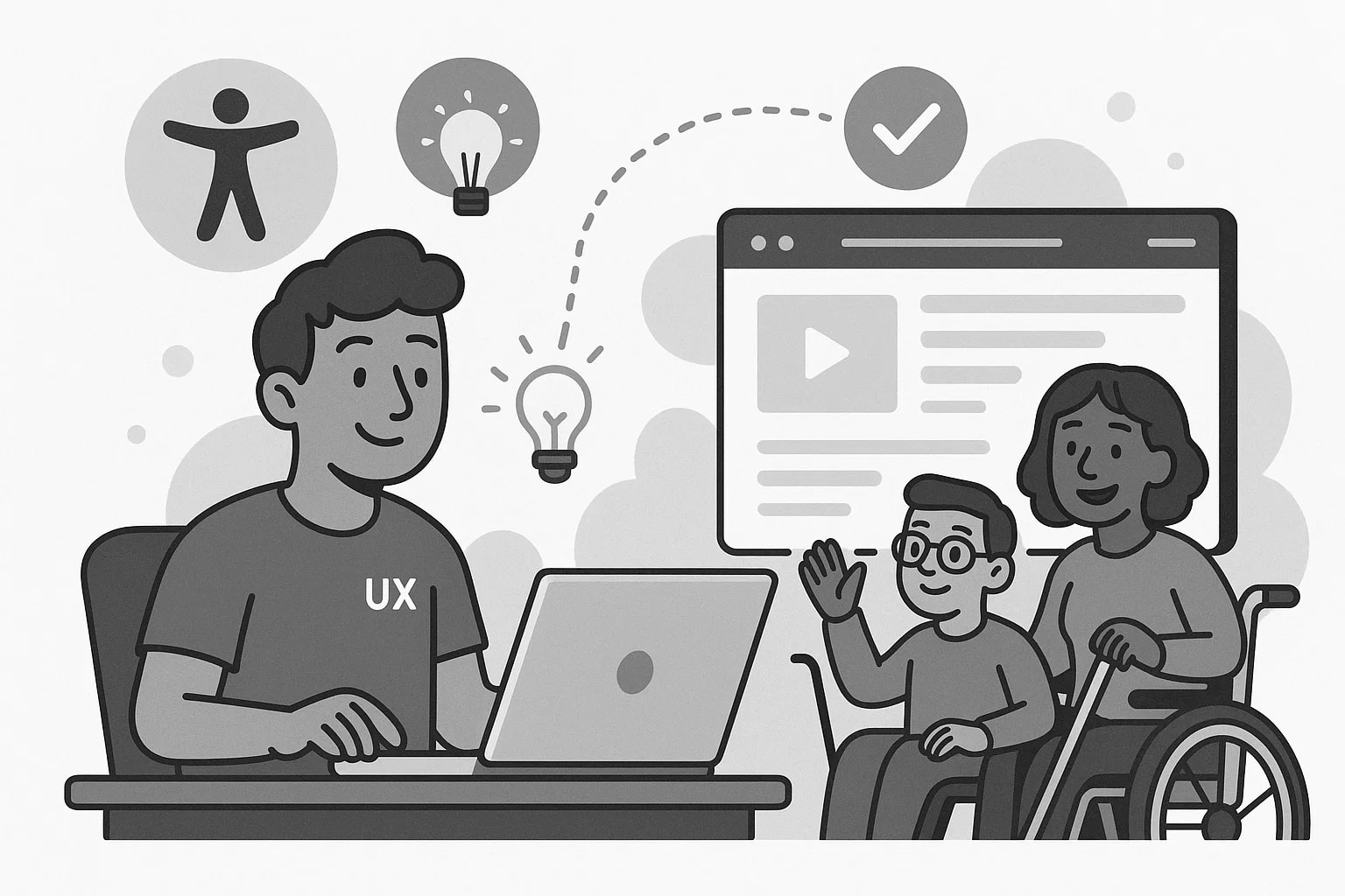
When I first heard people talking about "accessibility," it felt a little abstract, like one of those corporate checklist items that nobody really understood but everyone agreed we should probably care about. I knew it was important. I wanted to do the right thing. But early on, it honestly felt like extra work that slowed everything down. It took getting out of my own head, and watching real users interact with real products, for accessibility to finally click for me.
The Wake-Up Call
The first wake-up call happened during a simple user test. We had built a fairly straightforward form: name, email, a couple of dropdowns (because regular old select boxes were totally gross, and off brand). Everything looked great. Felt clean. Everyone high-fived themselves at the design review.
Then someone complained about not being able to complete the form using just a keyboard. Wait, people do that? Turns out, lots more people bounce around web pages with their keyboards than we realized. It was pretty eye opening. We learned that the tab order was unpredictable because things were in different orders at different breakpoints. Focus got trapped in weird places when and if the drop downs opened. Some of the dropdowns didn’t even open. Watching that made it impossible to think of accessibility as "extra work" ever again.
Small Changes, Real Improvements
After that, the way I approached building interfaces shifted. It wasn’t about chasing WCAG compliance for the sake of ticking a box. It was about making things genuinely easier, more intuitive, and more inclusive, without needing an asterisk. To be honest, I enjoyed the new challenge of nerding out on the details that made a difference.
At first, I over did it. I guess that's normal with a new found zeal. I started adding ARIA labels as a default habit (to everything), not an afterthought. But, I was on the right track, building good habts. I stopped relying on placeholder text in form fields to communicate important instructions. I made sure every component we shipped worked for keyboard users before worrying about swipe gestures and hover states. And, although I didn't have a bonafide screen reader at my disposal, I started testing with VoiceOver and NVDA whenever I could. Yeh, it was a little clunky at first. But I learned a ton about how people actually used our interfaces.
None of it felt flashy. Nobody ever commented, "Wow, look at that beautifully coded aria-describedby attribute!" Hard to believe, I know. But people completed tasks faster. Fewer users bounced in frustration. Support tickets for basic usability problems started to drop. And honestly, the code just felt cleaner. When you build something accessible, you usually build it better for everyone... even other developers.
Why It’s Part of Craftsmanship
The funny thing is, accessibility still gets thrown around as a buzzword sometimes. It’s easy to promise. It’s harder to actually weave into day-to-day development when deadlines are tight and scope is creeping. I get it. I've been there too.
But from where I stand now, it's not some heroic extra feature you bolt on at the end. It's just part of making good software. The best accessibility work isn’t about being perfect. It’s about caring enough to notice the little things. It’s about choosing to make your work usable for more people, even if no one’s holding you accountable for it.
And once I started seeing it that way, I couldn't really unsee it.